Users dashboard
Overview
The Users dashboard is the launching point for user behavior analysis and threat prevention.
This dashboard provides visibility into user behavior patterns across an organization. Using this data, you can proactively monitor, detect, and flag behavior that falls outside the norm, such as phishing or ransomware attacks.
To view the Users dashboard, go to Security > Users. The Users dashboard contains the following sections:
-
User active status: Distribution of total, active, and inactive users.
-
User risk distribution: Distribution of active, inactive, total users, and distribution of risk users in high, medium, and low profiles based on their highest computed risk score in the selected time period.
-
Top Users: Top Users are sorted by their risk score and segmented by All Users, Privileged Users, and Watchlist Users.
-
Risk Categories: Displays the risk categories that Citrix Analytics supports. Risk indicators with similar behavioral patterns are grouped into categories.
-
Risk Indicators and Actions: Distribution of risk indicators and actions plotted over a selected duration across all users in your organization.
-
Access Summary: Summarizes the total number of attempts that users have made to access the resources within your organization.
-
Policies and Actions: Displays the top five policies and actions applied on user profiles.
-
Risk Indicators: Displays the top five risk indicators in your organization.
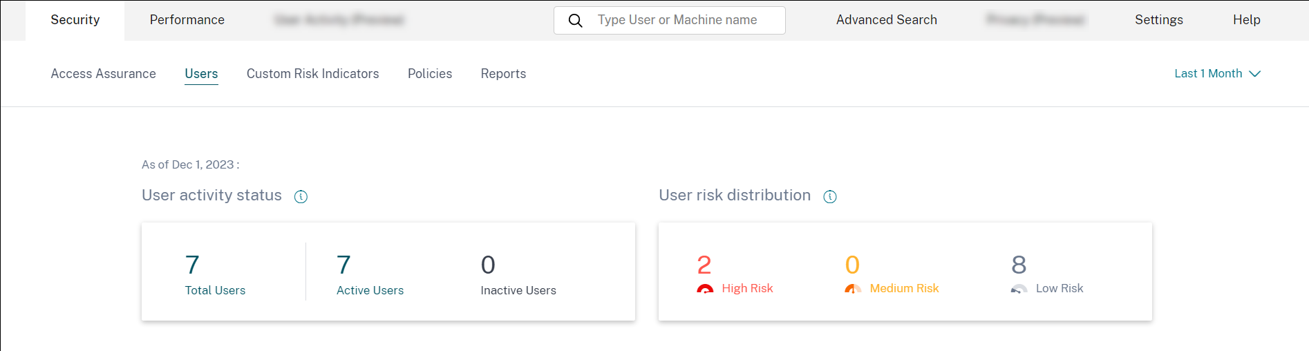
User activity status
Total number of users in your organization using the data sources for which you have enabled Analytics. They might or might not have a risk score associated with their account. This tile shows the number of active users. Active users are the users with events detected within the selected time period. You can click the user activity status drop-down menu to view the distribution of total users into active and inactive users.
- Total users: Total number of users in the selected time frame.
- Active users: Users with events detected in the selected time frame.
- Inactive users: Users with no events detected in the selected time frame.
The total number of users on the Users dashboard might be more than the number of risky users since all users are not expected to be risky.
Note
On the Users page, the total number of users is displayed for the last 30 days irrespective of the selected time period.
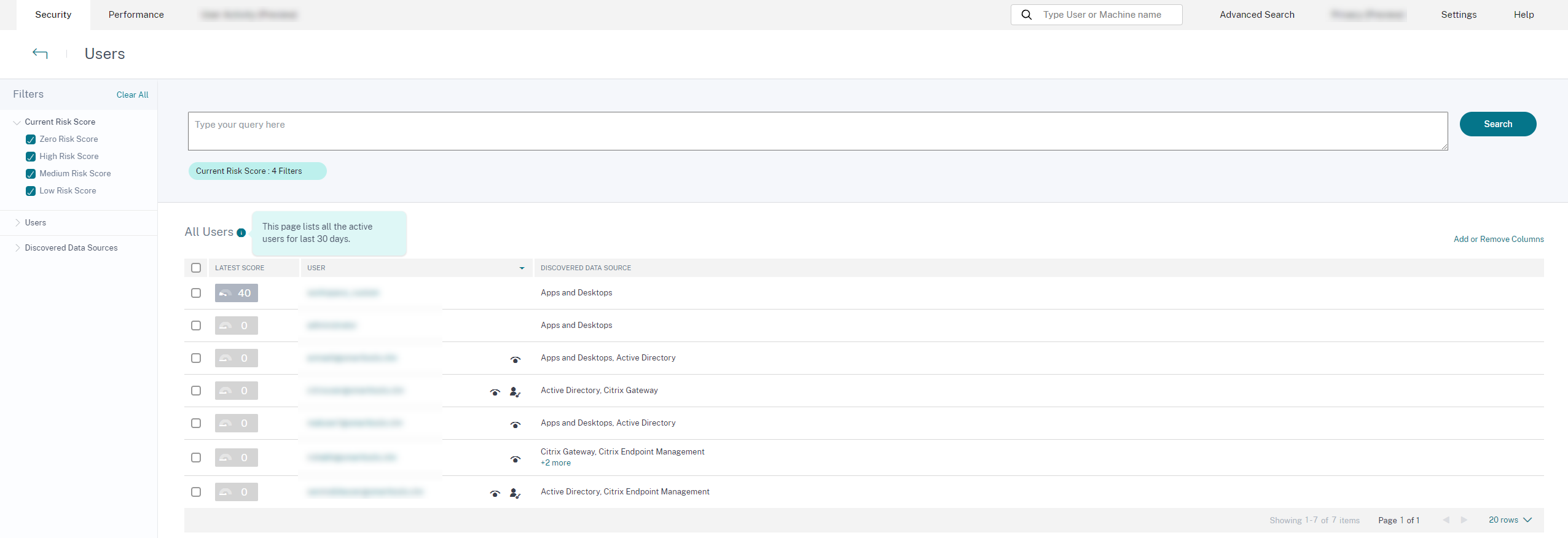
Facets
Filter the user events based on the following categories:
-
Risk Score: User events based on high-risk, medium-risk, low-risk, and zero-risk scores.
-
User: User events based on admin privilege, executive privilege, and watchlist users.
-
Discovered Data Sources: User events based on the data source that you have onboarded.
Search box
Use the search box to search events for the users. You can use operators in your query to narrow down the focus of your search. For information on the valid operators that you can use in your query, see Self-service search.
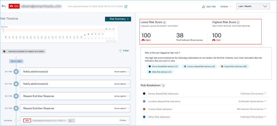
Latest score
The risk score determines the level of risk a user poses to an organization for a specific time period. The risk score value is dynamic and varies based on user behavior analytics. Based on the latest risk score, a user can fall under one of the categories: high-risk user, medium-risk user, low-risk user, and user with zero risk score.
User
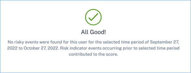
List of all users discovered by Analytics. Select a user name to view the user information and risk timeline for the user. The user might or might not have triggered any risk indicator. If there are no risky events associated with this user, you see the following message.
If there are risky events associated with a user, you see the risk indicators on their risk timeline. Select the user to view their risk timeline.
A user can be marked as privileged and added to the watchlist.
Discovered data source
The data source associated with a user. When a user is actively using the data source, Analytics receives the user events from that data source. To receive user events, you must turn on data processing on the data source site card, which is available on the Data Sources page.
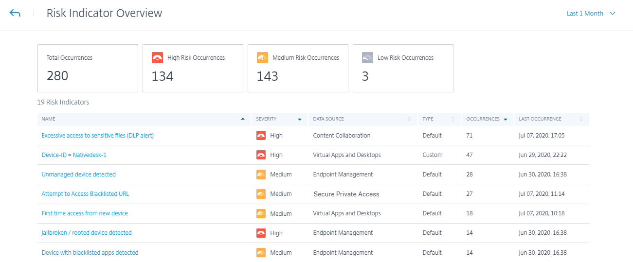
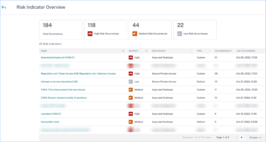
Indicators triggered
Indicates the number of risk indicators triggered across users for the selected duration. Click the Indicators triggered tile to view the risk indicators details. The risk indicator table provides the following details:
- Name: The risk indicator name.
- Severity: The severity of the risk associated with the event. The risk can be high, medium, or low.
- Data source: The data source on which the risk indicator template applies.
- Type: Type of risk indicator. A risk indicator can be default or custom.
- Occurrences: The number of times a risk indicator is triggered for a user. When you select the time period, the risk indicator occurrences change based on the time selection.
- Last occurrence: Shows the last occurrence date and time.
Actions applied
Indicates the number of actions applied across users for the selected duration. This includes the actions applied manually by the administrators and the policy-driven actions. Click the Action applied tile to view the action details. This section does not display the actions that you have applied manually on the user profiles.
The Action table provides the following information:
- Action: Name of the action applied as per the policy.
- Users: Number of users to which the action has been applied.
- Occurrences: Number of occurrences of the action.
- Date and Time: Date and time of the applied action.
Events processed
Total number of user events received from your connected data sources and processed by Analytics.
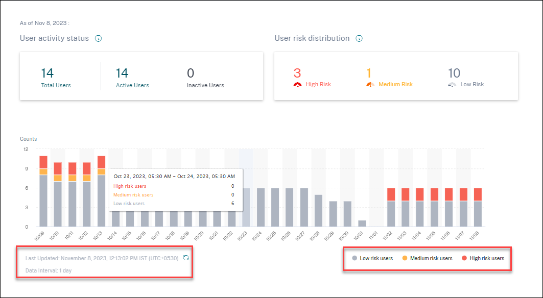
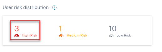
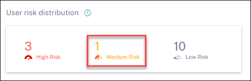
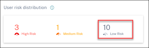
User risk distribution
You can view the number of users in high, medium, and low profiles based on their highest computed risk score in the selected time period. Below the overall counts, a bar chart shows changes over time in the distribution of low, medium, and high-risk users.
The level of risk is categorized into three color codes.
- Red - Represents high-risk users.
- Orange – Represents medium-risk users.
- Grey – Represents low-risk users.
You can view the numbers of risky users (high, medium, and low) while hovering your mouse on the color bars based on a specific time period. You can view the last updated details (date and time) with the data interval information. Click any color bar to see the risk users in that duration. Click the refresh option to get the updated data.
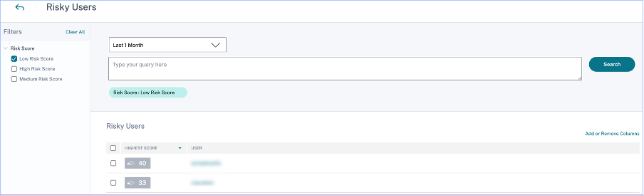
Risky users
Risky users are users who have risky events associated and have triggered at least one risk indicator. The level of risk a user poses to the network for a specific time period is determined by the risk score associated with the user. The risk score value is dynamic and is based on user behavior analytics.
Each user’s risk is regularly updated over time based on user activity. Therefore a user might be medium or high risk at one point in time, but drop to a lower risk level later. Based on the risk score, a risky user can fall into one of the following categories:
On the Risky Users page, you can use the facets to filter based on risk levels associated with the selected time period, and the search bar to query for a specific user or users.
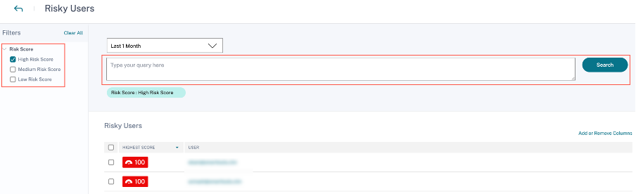
Click the user’s email ID to view the Risk timeline page for that particular selected user. This page displays the risk indicators along with Latest and Highest risk score details based on the selected time period.
High risk
Users with risk scores between 90 and 100. These users have exhibited multiple behaviors consistent with moderate to severe risk factors and might represent immediate threats to the organization.
On the Users dashboard, you can view the number of high-risk users based on the highest computed risk score in the selected time period.
Click the High Risk option to view the Risky users page. The page displays the details about the high-risk users.
Medium risk
Users with risk scores between 70 and 89. These users have typically one or more activities that appear potentially suspicious and/or anomalous and might be worth monitoring closely.
Click the Medium Risk option to view the Risky users page. The page displays the details about the medium-risk users.
Low risk
Users with risk scores between 1 and 69. These users have at least one risk indicator reflecting some unusual or unexpected behavior, but not enough to merit a more serious risk classification.
Click the Low Risk option to view the Risky users page. The page displays the details about the low risk users.
Top users
You can view the top users in various user categories sorted by highest risk scores for the selected time period. The following Top users table shows the top five highest risk users (all, privileged, and watchlist users) based on their risk score calculated over the selected time period, rather than the latest risk score.
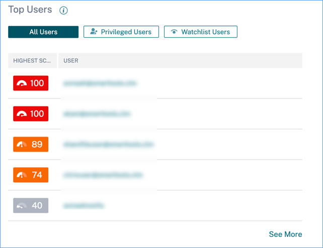
Note
In earlier versions, the Top Users table always displayed the latest risk score, regardless of the time period selected.
Watchlist users
List of users monitored closely for potential threats. For example, you can monitor users who are not full-time employees within your organization by adding those users to the watchlist. You can also monitor users who trigger a specific risk indicator frequently. You either add a user to the watchlist manually or define policies to add users to the watchlist.
If you have added users to the watchlist, you can view the top five users in the watchlist based on the highest score.
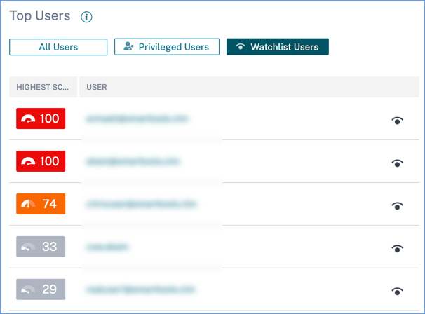
Click the See More link on the All Users pane to view the Users page. The page displays the list of all users in the watchlist.
Note
On the Users dashboard and the Users page, the number of users in the watchlist are displayed for the last 13 months irrespective of the selected time period. When you select a time period, the risk indicator occurrences change based on the time selection.
Learn More: Watchlist
Risk Categories
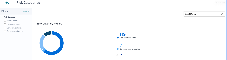
The Risk Categories donut chart summarizes the number of indicator occurrences by risk category during the selected time period. Unique user counts are displayed on the hover over each chart segment, which in turn links to the corresponding Risk Indicator Category overview page. Risk categorization is supported by default and custom risk indicators.
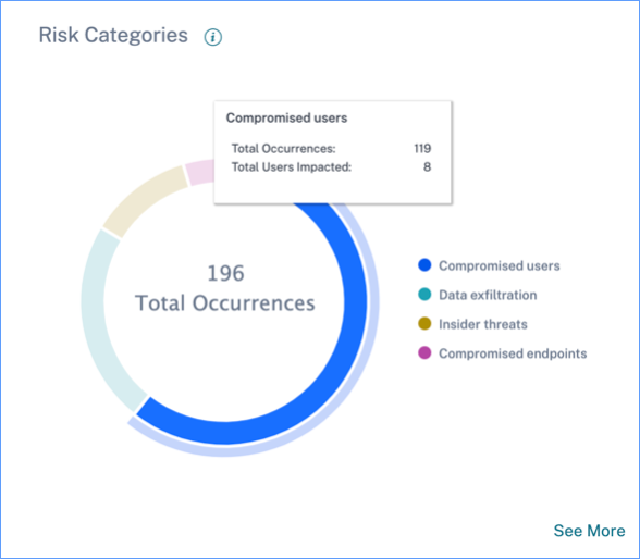
The purpose of the Risk Categories dashboard is to enable Citrix Virtual Apps and Desktops and Citrix DaaS administrators manage user risks and have simplified discussions with their security counterparts without the need to have an expert-level security knowledge. It allows security enforcement to take effect at an organizational level and is not limited to security administrators alone.
Use case
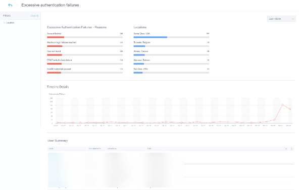
Consider that you are a Citrix Virtual Apps and Desktops administrator and you manage the application access rights of employees in your organization. If you go to the Risk Categories > Compromised users > Excessive authentication failures - Citrix Gateway risk indicator section, you can assess whether the employees to whom you had granted access have been compromised. If you navigate further, you can get more accurate insights into this risk indicator such as the failure reasons, sign-in locations, timeline details, and user summary. If you notice any discrepancies between the users that were granted access and the users that were compromised, you can notify the security administrator about it. This timely notification to the security administrator contributes towards enforcement of security at an organizational level.
How to analyze the Risk Categories dashboard?
When you select See More on the Risk Categories dashboard, you are redirected to the page that summarizes details about the risk categories. This page contains the following details:
-
Risk category report: Represents the total risk indicator occurrences of each category for a selected time period.
-
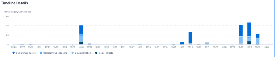
Timeline details: Provides a graphical representation of the total risk indicator occurrences of every risk category for a selected time period. If you navigate to the bottom of this section, you can sort based on risk categories for more accurate insights about the risk indicators.
-
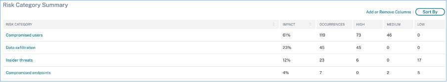
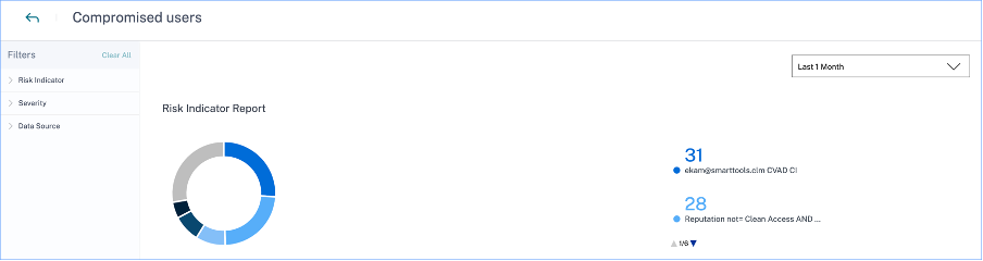
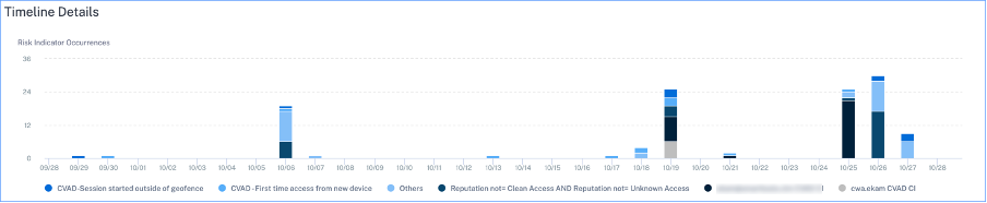
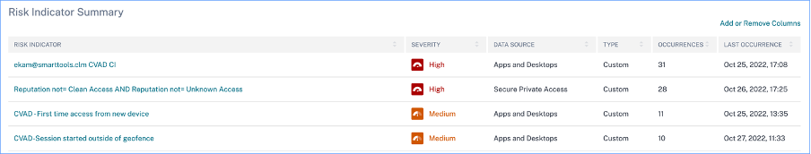
Risk category summary: This section provides details such as the impact, occurrences, and severity of the risk indicators associated with each category. Select any risk category to view details about the risk indicators associated with that category. For example, when you select the Compromised users category, you are redirected to the Compromised users page.
The Compromised users page displays the following details:
-
Risk Indicator Report: Displays the risk indicators that belong to the Compromised users category for a selected time period. It also displays the total occurrences of the risk indicators that were triggered during the selected time period.
-
Timeline Details: Provides a graphical representation of the risk indicator occurrences for a selected time period.
-
Risk Indicator Summary: Displays a summary of the risk indicators generated under the compromised users category. This section also displays the severity, data source, risk indicator type, occurrences, and the last occurrence.
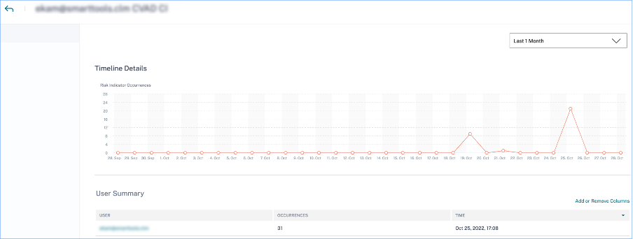
When you select a risk indicator, you are redirected to the page that summarizes the details of that indicator. For example, if you select the First time access from new device risk indicator, you are redirected to the page that summarizes details about this indicator. The summary includes timeline details about the occurrences of this event and a user summary that lists the users that triggered this risk indicator, risk indicator occurrences, and the time of the event. When you select a user, you are redirected to the user’s risk timeline.
Note
Citrix Analytics groups default risk indicators under the appropriate risk category. For custom risk indicators, you must select a risk category on the Create Indicator page. For more information, see Custom risk indicators.
Types of risk categories
Data exfiltration
This category groups risk indicators triggered by malware or by employees who perform unauthorized data transfers or data thefts to or from a device in an organization. You can get insights into all the data exfiltration activities that have taken place during a specified time period, and mitigate the risks associated with this category by proactively applying actions on user profiles.
The Data exfiltration risk category groups the following risk indicator:
| Data Sources | User Risk Indicators |
|---|---|
| Citrix Virtual Apps and Desktops and Citrix DaaS | Potential data exfiltration |
Insider threats
This category groups risk indicators triggered by employees within an organization. Since employees have higher levels of access to company-specific applications, organizations are at a higher chance of security risks. Risky activities might be intentionally caused by a malicious insider or might be a result of a human error. In either of the scenarios, the security impact on the organization is damaging. This category provides insights into all the insider threat activities that have taken place during a specified time period. With the help of these insights, you can mitigate the risks associated with this category by proactively applying actions on user profiles.
The Insider threats risk category groups the following risk indicators together:
| Data Sources | User Risk Indicators |
|---|---|
| Citrix Secure Private Access™ | Attempt to access the blacklisted URL |
| Citrix Secure Private Access | Excessive data download |
| Citrix Secure Private Access | Risky website access |
| Citrix Secure Private Access | Unusual upload volume |
Compromised users
This category groups risk indicators in which users display unusual behavioral patterns such as suspicious sign-ins, and sign-in failures. Alternatively, the unusual patterns might be a result of the user accounts being compromised. You can get insights into all the compromised user events that have taken place during a specified time period, and mitigate risks associated with this category by proactively applying actions on user profiles.
The Compromised users’ risk category groups the following risk indicators together:
| Data Sources | User Risk Indicators |
|---|---|
| Citrix Gateway | End point analysis scan failure |
| Citrix Gateway | Excessive authentication failures |
| Citrix Gateway | Impossible travel |
| Citrix Gateway | Logon from suspicious IP |
| Citrix Gateway | Unusual authentication failure |
| Citrix Virtual Apps and Desktops and Citrix DaaS | Suspicious Logon |
| Citrix Virtual Apps and Desktops and Citrix DaaS | Impossible travel |
| Microsoft Graph Security | Azure AD Identity Protection risk indicators |
| Microsoft Graph Security | Microsoft Defender for Endpoint risk indicators |
Compromised endpoints
This category groups risk indicators that are triggered when devices exhibit unsecure behavior that might indicate a compromise.
The Compromised endpoints risk category groups the following risk indicators together:
| Data Sources | User Risk Indicators |
|---|---|
| Citrix Endpoint Management™ | Unmanaged device detected |
| Citrix Endpoint Management | Jailbroken or rooted device detected |
| Citrix Endpoint Management | Device with blacklisted apps detected |
Risk indicators and actions
You can view the triggered risk indicators and the applied actions for your users for the selected time period. The new Risk Indicators and Actions bar chart provides the counts of indicators, actions, and events detail over time, with the overall time range and bar interval derived from the selected time period.
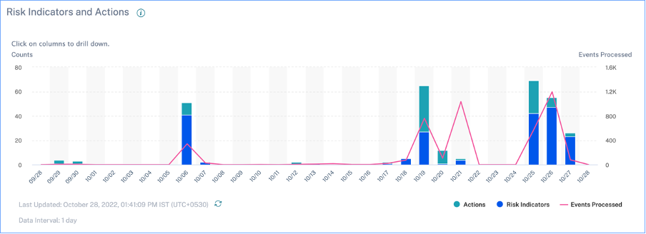
Clicking a bar segment for either indicators or actions yields a drill-down visualization of the counts per indicator or action, respectively.
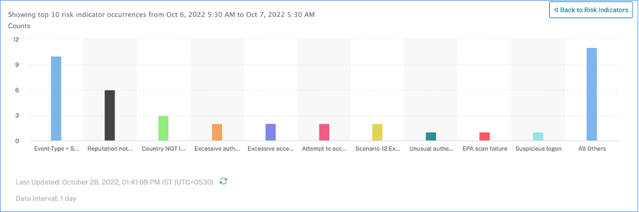
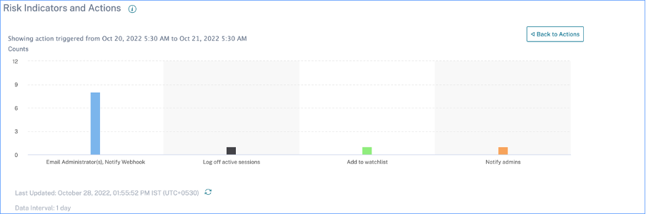
In the indicator drill-down, clicking an individual indicator bar goes to the corresponding risk indicator page, for the selected time period.
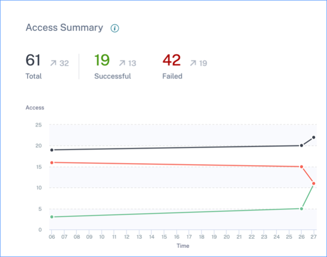
Access Summary
This dashboard summarizes all the Gateway access events for a selected time period. It shows the number of total access, successful access, and failed access through Citrix Gateway.
Click the pointers on the graph to view the Self-service search for Gateway page. For successful sign-in scenarios, Gateway access events are sorted by the status code on the page.
Policies and Actions
Displays the top five policies and actions applied on user profiles for a selected time period. Click the See More link on the Policies and Actions pane to get detailed information about the policies and actions.
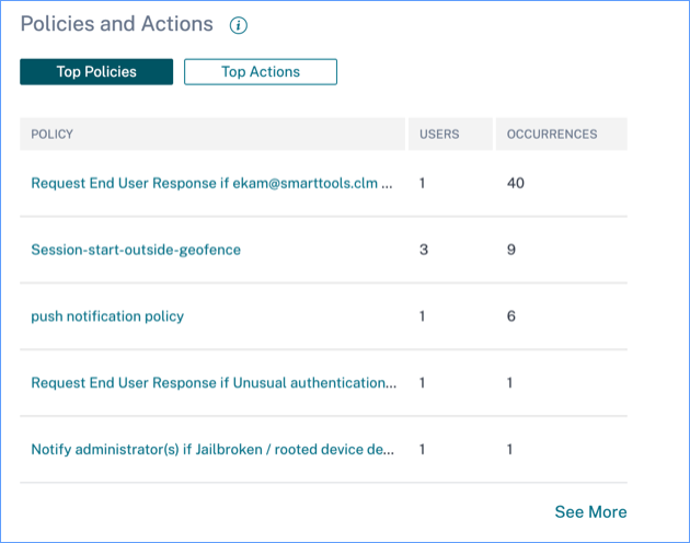
Top Policies
The top five configured policies are determined based on the number of occurrences. When you are in the Top Policies section of the dashboard and select See More, you are redirected to the All Policies page.
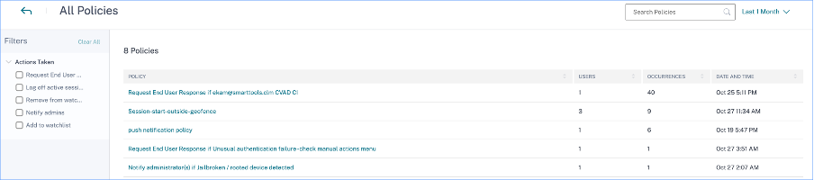
All policies
This page provides detailed information about all the configured policies. When you select any policy, you are redirected to the Self-service search for Policies page. On the left pane, you can filter based on the actions applied.
When you select a user name, you are redirected to the risk timeline. The policy-based action is added to the user’s risk timeline. When you select the action, its details are displayed on the right pane of the risk timeline.
Top Actions
The top five actions associated with the policies that were applied to the user profiles. This section does not display the actions that you have applied manually on the user profiles. The top actions are determined by the number of occurrences.
Click See More to view all the policies-based actions on the Actions page.
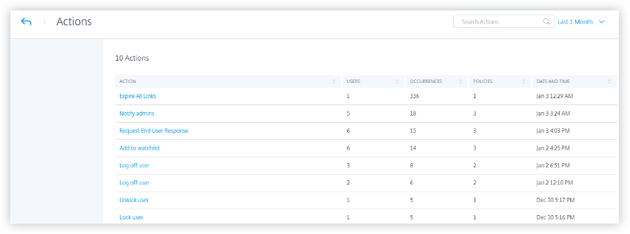
Actions
The page provides the list of all policies-based actions that have been applied to your users for the selected time period. You view the following information:
-
Name of the action applied as per the policy
-
Number of users on which the action has been applied
-
Number of occurrences of the action
-
Number of policies associated with the action
-
Date and time of the applied action
Click an action to view all the associated policies. These policies are sorted based on the number of occurrences. For example, click Request end user response on the Actions page. The All Policies page displays all the policies associated with the Request end user response action.
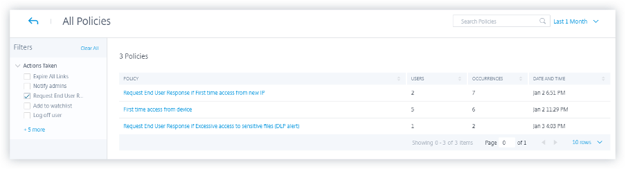
On the All Policies page, click a policy to view the user events on which the action has been applied.
Risk Indicators
Summarizes the top five risk indicators for a selected time period. The risk indicators can be default or custom. For default risk indicators, Citrix Analytics collects data from the discovered data sources and on which the data processing is enabled.
For custom risk indicators, Citrix Analytics collects data from the following data sources based on the risky events generated:
- Citrix Gateway
- Citrix Secure Private Access
- Citrix Virtual Apps and Desktops™
- Citrix DaaS (formerly Citrix Virtual Apps and Desktops service)
On the Risk Indicators pane, you can view the top five risk indicators and sort them based on total occurrences or severity.
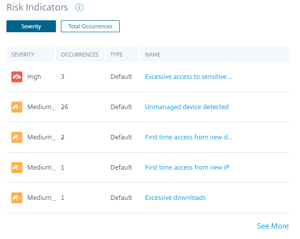
Click See More on the Risk Indicators pane to view the Risk Indicator Overview page.