User Experience Analytics
What is User Experience Analytics?
The User Experience Analytics gives actionable insights into the user and session performance parameters of your environment.
- User Experience Analytics provides a comprehensive analytical solution for all the Sites across an organization in a single consolidated dashboard.
- User Experience Analytics analyzes user sessions based on important parameters that define its performance - Session Logon Duration, Session Responsiveness, Session Availability, and Session Resiliency.
- The performance metrics are baselined using dynamic thresholds. The thresholds help measure the Session Experience score and categorize sessions into Excellent, Fair, or Poor categories.
- The User Experience (UX) score is calculated with the individual Session Experience scores. The UX score quantifies the complete user experience in the Sites and allows for users to be segregated as having an Excellent, Fair, or Poor experience.
- The drilldown view further provides an overview of the user performance across factors and subfactors, providing specific actionable insights for users facing suboptimal experience.
How to access the User Experience dashboard
To view the User Experience dashboard:
-
Log on to Citrix Cloud™ and select the Cloud Customer.
-
On the Analytics Service tile, click Manage.
-
On the Analytics overview page, click Manage under the Performance offering.
-
Click the Users tab.
How to use the User Experience dashboard
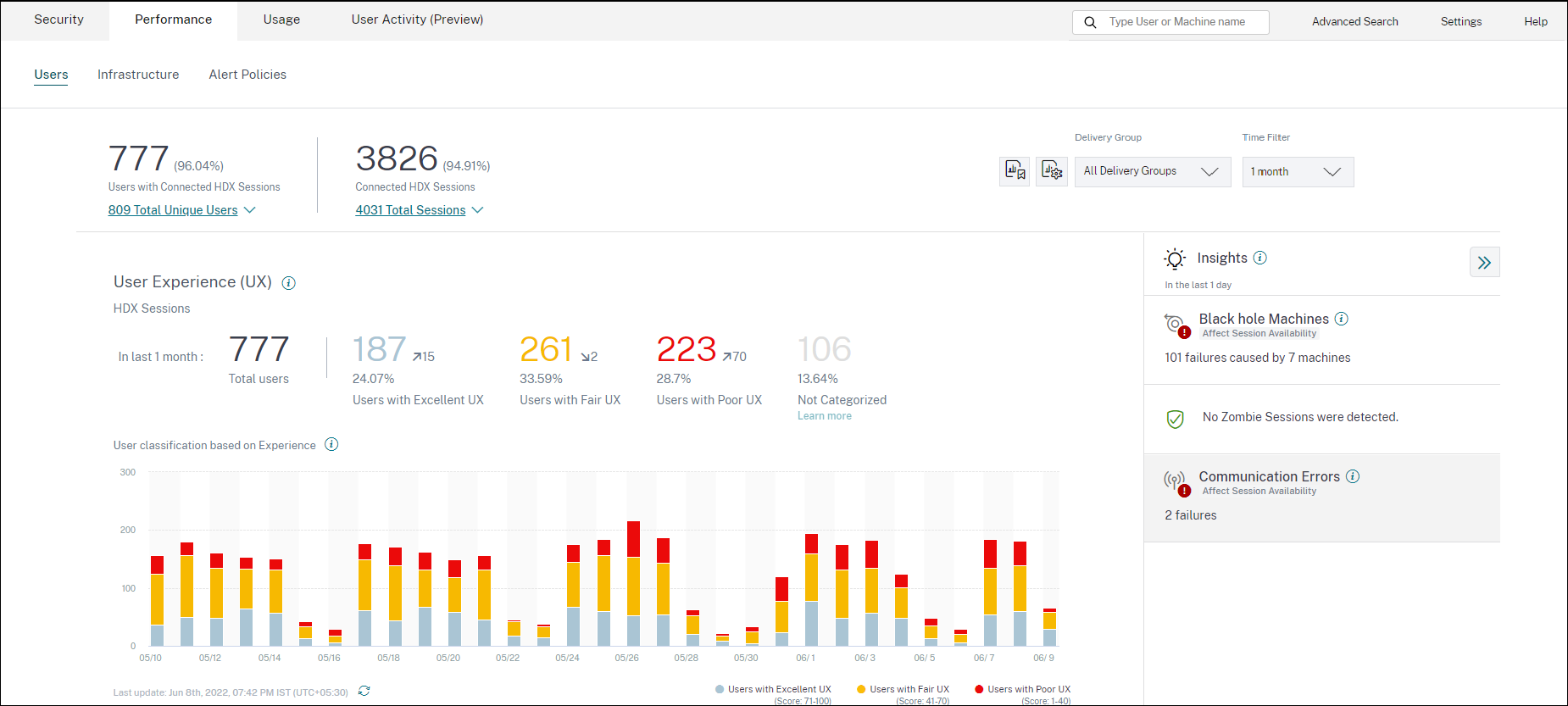
Site selection is available if multiple Sites are present in the environment. Use the Time Filter to select the required duration, and select the required Delivery Groups. The dashboard gives an overview of the user and session experience. You get,
- User classification of users running HDX™ sessions based on User Experience.
- Trend of user classification for the selected duration.
- Trend of user sessions and session failures for the selected duration.
- Session classification based on Session Responsiveness and Session Logon Duration factors.
The following section describes the various elements on the User Experience dashboard.
User Experience score
The UX score is a comprehensive end user experience index calculated based on the performance factors that affect a user session. Metrics that are measured through the session life cycle from its launch attempt to its end, contribute to the calculation of the UX Score.
-
Session Logon Duration represents the session launch experience.
-
Session Responsiveness represents the in-session responsiveness or session latency.
-
Session Availability represents the success rate of establishing a session connection when attempted by the user.
-
Session Resiliency indicates how the Workspace app recovers from network failures when the user is connected over a sluggish network. It measures the reconnection rate.
For more information about the UX score calculation and threshold calibration for user classification, see the UX score article.
Granularity of data collection is based on the selected time period. All data on the dashboard and the drilldown screens is obtained and refreshed from the database as per the data collection granularity. Click the refresh icon to update the data immediately.
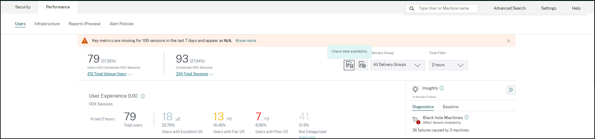
Breakup of Users and Sessions
The dashboard now shows the breakup of users and sessions in the virtual apps and desktops environment based on the session protocol and the connection status.
The dashboard provides performance metrics for only connected HDX sessions. Sessions that have been disconnected throughout during the selected period indicates that the user was not active for the entire selected period. Hence, Session and User Experience scores are not applicable for disconnected sessions.
The following metrics are available in the breakup:
- Number and percentage of users with connected HDX sessions
- Number and percentage of connected HDX sessions
- Total number of unique users with breakup
- Total number of sessions with breakup
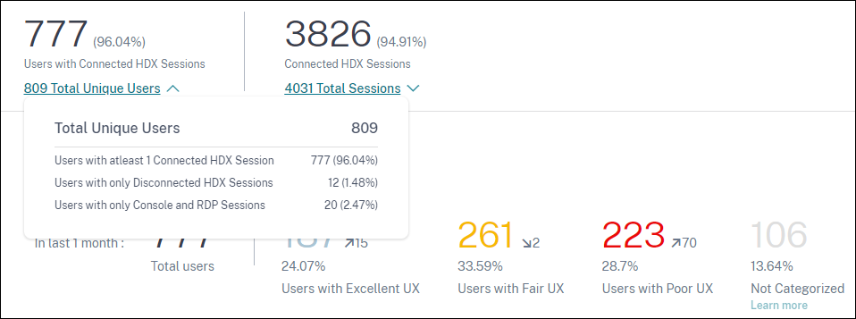
Based on the session protocols and connection status, the total unique users are classified as:
- Users with at least one Connected HDX Session: These users have had at least one HDX session in connected state at some point during the time interval.
- Users with only Disconnected HDX Sessions: All the sessions of these users have been disconnected throughout the time interval.
- Users with only Console and RDP Sessions
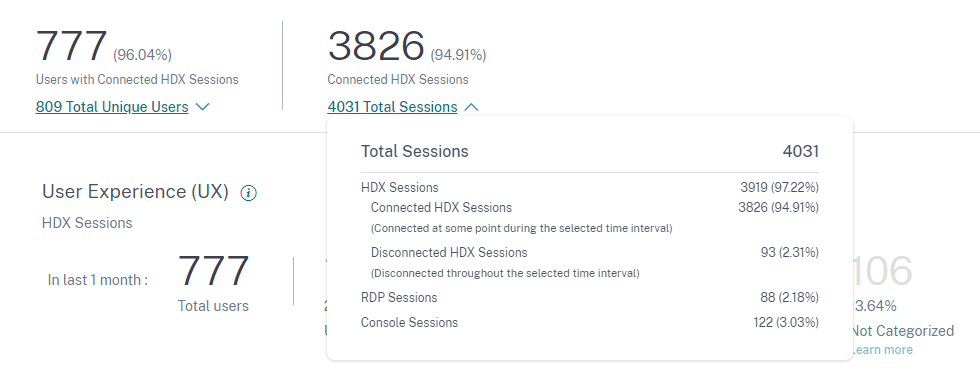
Based on the session protocols and connection status, the total sessions are also categorized similarly as follows:
- HDX Sessions
- HDX Connected Sessions: Sessions that were in connected state at some point during the time interval.
- HDX Disconnected Sessions: Sessions that were in disconnected state throughout the time interval.
- RDP Sessions
- Console Sessions
User Classification by Experience
To view the classification of users based on the UX score:
-
On the Users tab, select the time period for which you want to view the User Experience. The last 2 hours (2H) time period is selected by default.
-
Select the Site and Delivery Groups. If you select All Sites, metrics consolidated across all the Sites are displayed.
-
The total number of active users in one or more selected Sites and Delivery Groups for the selected time duration is displayed.
-
Users distribution across each of the Excellent, Fair, and Poor categories based on their UX Scores is displayed in numbers and percentages. The User Experience score thresholds for classification of users are calculated using statistical methods.
- Users with Excellent UX: Represents users with a UX score of 71-100. Users with Excellent UX had a consistently good experience across all factors.
- Users with Fair UX: Represents users with a UX score of 41-70. These users had a degraded experience for a limited period across certain factors.
- Users with Poor UX: Represents users with a UX score 1–40. These users had a prolonged degradation across several indicators.
- User Not Categorized: For information about users that are Not Categorized, see the Not Categorized Metrics article.
User Classification Trend
-
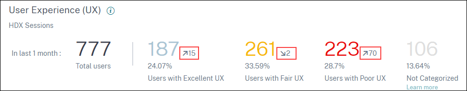
The up/down arrows indicate the trend in the number of users. It shows an increment or decrement of the number of users in each category as compared to the previous time period. For example, in the following scenario,
-
In the last 1 month, the Site had logons by a total of 777 users.
-
Of these, 187 users had an excellent user experience in the last month. This count is 15 users more than the number of users who had an excellent user experience in the previous month. So, the previous month had 172 users with an excellent user experience.
-
261 users had a fair user experience in the last month. This count is 2 users lesser those who had a fair experience in the previous month.
-
223 users had a poor user experience in the last month. 153 users had a poor experience in the previous month.
-
-
Click the categorized user numbers to further drill down into the factors affecting those users. For more information, see the Factor Drilldown article.
-
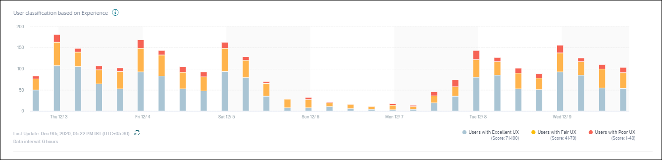
The User classification based on Experience trend displays the distribution of users across the categories during the selected time period. The length of a color on the bar indicates the number of users in an experience category.
-
Hovering over the chart displays a tooltip containing the user classification for the specific data interval. Click the Excellent, Fair, or Poor region on the bars to see the drilldown displaying the classification of the specific set of users for the data interval represented by the bar.
User Sessions
A user session is created when an app or a desktop is launched from the Workspace app. The user interacts with the app or desktop through the user session. The experience the user has in each session adds up to the overall experience of the user in the Apps and Desktops environment.
The User Sessions section of the User Experience dashboard displays important session metrics of HDX sessions for the chosen time period, Site, and Delivery Groups.
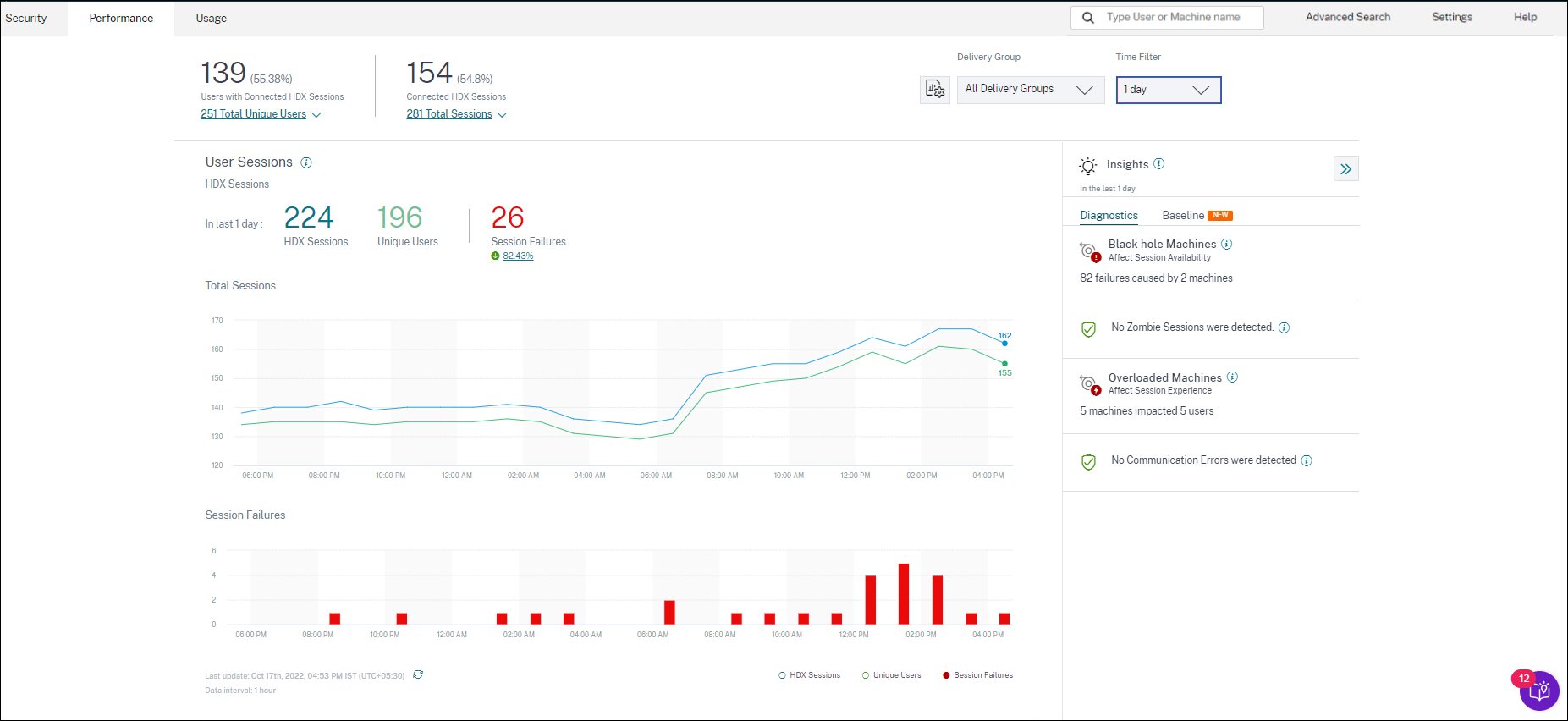
You can view the following user session data:
-
Total Sessions: Total number of user sessions over the chosen time period. A single user can establish multiple user sessions. The number includes all sessions launched or active during the chosen period.
-
Total Unique Users: Number of unique users who either launched a session or have an active session during the chosen period.
-
Session Failures: Number of user sessions that failed to launch during this time period. Clicking the failure count opens the Sessions based self-Service search. Hover over the graphs to view detailed information for a specific collection interval. The charts help identify the pattern in the failures versus the total number of sessions connected. The unique users trend helps analyze the license usage in the Site and selected Delivery Groups. Deviation from the baseline is also displayed, clicking the deviation displays the respective Baseline Insight. For more information about Insights, see the Insights article.
-
Failure Insights: Insights into the causes for session failure, drill down to specific users, sessions, or machines that the failures are associated with. Also available is a set of recommended steps to mitigate the failures. For more information, see the Insights article.
Session Responsiveness
Session Responsiveness represents the ICA® Round Trip Time (ICA RTT). ICA RTT is used to quantify the response time. It is the amount of time it takes for user input to reach the server and the response to appear on the endpoint machine. It measures the in-session experience and quantifies the lag experienced while interacting with a virtual app or desktop.
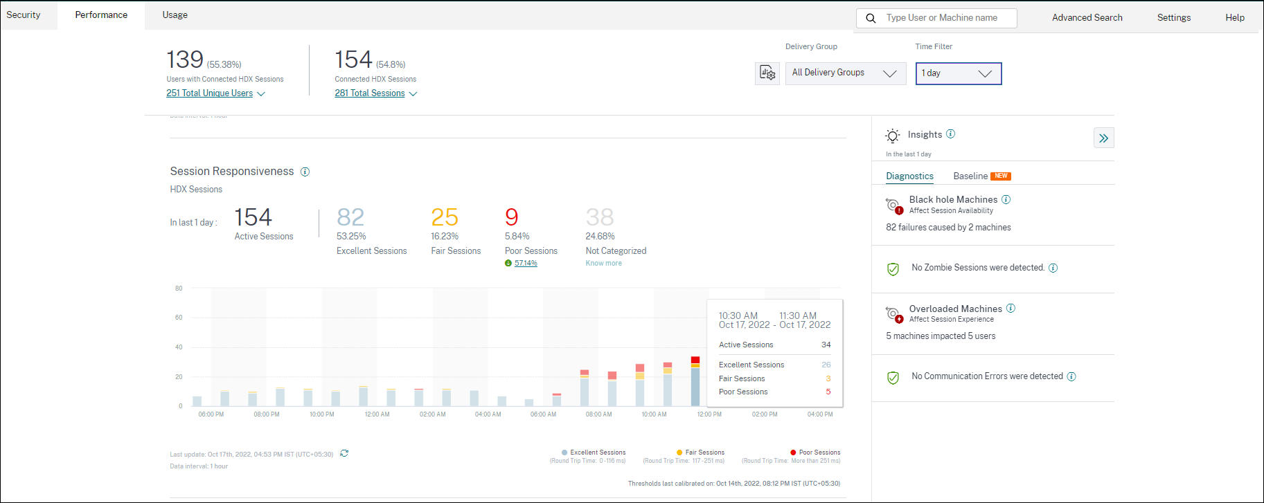
The Session Responsiveness section has the following information:
Active sessions: Active sessions are user sessions currently in operation and connected to Apps and Desktops.
Session classification: Sessions are categorized as Excellent, Fair, or Poor based on their ICA RTT measurements over the selected time period. Click the classification numbers to view the Sessions based self-Service search for the selected set of sessions.
The thresholds for categorization are calculated for the current customer and are recalibrated dynamically. For more information, see the Dynamic thresholding documentation.
Deviation from the baseline is also displayed, clicking the deviation displays the respective Baseline Insight. For more information about Insights, see the Insights article.
For information about sessions that are Not Categorized, see the Not Categorized Metrics article.
Session classification trend
Session classification is plotted for the selected Site and Delivery Groups across the selected time duration. The legend displays the current thresholds used to plot the chart and the last updated time for the thresholds.
The session classification trend based on Session Responsiveness helps identify sessions facing network issues.
Session Logon Duration
The period from when a user clicks an application or a desktop in the Citrix Workspace™ app to the instant the app or desktop is available for use is called the logon duration. The logon duration includes the time taken for various processes in the complex launch sequence. Total logon time includes phases such as Brokering, VM Start, HDX Connection, Authentication, Profile Load, Logon Script, GPO, and Shell Launch.
Breaking down the Session Logon Duration data to individual phases helps troubleshoot and identify a specific phase causing a longer logon duration.
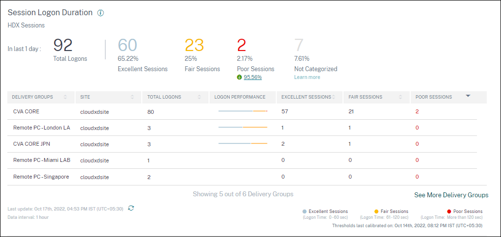
This section has the following information:
Total logons: The total number of logons to virtual apps or desktops in the selected duration, Site, and Delivery Groups.
Session classification: Sessions are categorized as Excellent, Fair, or Poor based on their Session Logon Duration measurements over the selected time period. Click the classification numbers to view the Sessions based self-Service search for the selected set of sessions. The thresholds for categorization are calculated specifically for the current customer and are recalibrated dynamically. For more information, see the Dynamic thresholding documentation. The legend displays the current thresholds used to plot the chart and the last updated time for the thresholds. Deviation from the baseline is also displayed, clicking the deviation displays the respective Baseline Insight. For more information about Insights, see the Insights article.
Sessions Not Categorized for Logon Duration
Sessions might be Not Categorized for Logon Duration if the subfactors are not configured to be measured as described in Session Logon Duration subfactors.
Session Logon Duration sorted by Delivery Groups
Session Logon Duration data is displayed in tabular format with the following information:
-
Delivery group and the corresponding Site.
-
Session distribution chart based on performance indicators- Excellent, Fair, or Poor.
-
Total number of sessions.
-
Number of Excellent, Fair, and Poor sessions.
By default, the table data is sorted based on the Poor Sessions column. You can choose to sort it based on any of the other columns. The first five Delivery Groups based on the sort criteria are displayed. Click See More Delivery Groups to see more data.
This table helps identify the Delivery Groups with the maximum number of poor sessions. You can troubleshoot further to identify policies causing higher logon duration on the specific Delivery Group.
Approximation Mode
Data Sampling mode is available on the User Experience Dashboard in Citrix Analytics for Performance™ to help load the dashboard metrics faster. This mode is available on tenants with more than 25K active unique users in the past 30 days.
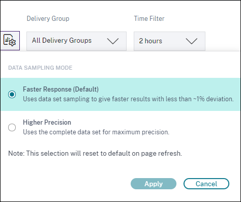
Data Sampling modes available are:
- Faster Response Mode: This mode uses data set sampling to arrive at performance metrics for all time periods. This helps load the metrics on the User Experience Dashboard faster especially in tenants with large number of users. The metrics deviate by approximately one percent from the numbers that are available in the Higher Precision mode. Faster Response is the default sampling mode. The dashboard gets reset to this mode upon page refresh for large tenants.
- Higher Precision Mode: This mode uses the complete data set to arrive at the performance metrics. Choosing this mode might result in slower loading of the dashboard. You can choose this mode to see more accurate metrics for the exact period chosen. Data Sampling Mode feature is applicable on the User Experience Dashboard only. The Intermediate drilldown and the Self-service pages continue to operate in Faster Response mode.
Data Availability
Accuracy of Performance Analytics depends on the data collected from various site infrastructure like the endpoints, machines, Gateway, and Delivery Controller. A good availability of the required metrics ensures that the data and insights provided by Performance Analytics closely represents the actual performance of the site.
The Data Availability feature helps identify sessions that do not have the data required to monitor the performance of your endpoints. Endpoint metrics like Endpoint Link Speed, Location, Throughput, ISP, Network Interface type, OS and Endpoint receiver version that are critical to analyze issues specific to endpoints.
Endpoint metrics require that the StoreFront™ be onboarded correctly, and the Citrix Workspace App versions installed on the endpoints are correct. The number of sessions across all the onboarded sites which don’t have endpoint metrics during the past seven days is displayed when you open Citrix Analytics for Performance. If you are using Citrix Workspace, the service is automatically discovered and does not require onboarding.
Click Know more. A modal box containing the reasons in detail and the actions that you could take to solve the issues, is displayed. You can also click the Data Availability icon to view the modal.
For more information, see Self-service search for Sessions.
-
One of the key reasons for missing endpoint telemetry is StoreFront onboarding. StoreFront must be onboarded correctly; data processing must be switched on and appropriate URLs must be whitelisted. Review StoreFront Data Sources takes you to the Data Sources page that leads you through the StoreFront onboarding process required for the Workspace App Data Collection. Click Sessions missing endpoint data to open the Sessions self-service view with the list of sessions whose endpoint metrics are missing because of incorrect or non-existent StoreFront Onboarding. If you are using Citrix Workspace, the service is automatically discovered and does not require onboarding.
-
Endpoint telemetry is not available for sessions launched from endpoints that run unsupported OS platforms or incompatible Citrix Workspace app versions. Clicking Sessions missing endpoint data opens the Sessions self-service view with the list of the sessions missing endpoint telemetry due to a specific listed reason. For more information, see the Version matrix that lists for each feature, the OS versions and the required Workspace app version on which it is supported.
In this article
- What is User Experience Analytics?
- How to access the User Experience dashboard
- How to use the User Experience dashboard
- User Experience score
- Breakup of Users and Sessions
- User Classification by Experience
- User Sessions
- Session Responsiveness
- Session Logon Duration
- Approximation Mode
- Data Availability