Custom Reports (Preview)
You can create and schedule custom reports using the performance metrics in Citrix Analytics for Performance. Custom reports help you to extract information of specific interest and organize the data graphically. It helps to create executive reports in a regular cadence and analyze the performance of your environment over time.
Click Reports in Performance Analytics to see the list of existing reports in the current tenant. Expand the report row to see a preview of the report.
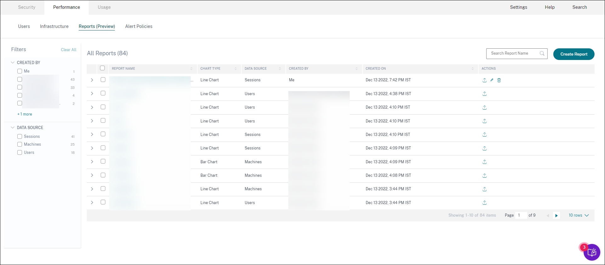
You can perform the following actions on reports using this view:
- Click Create Report to create a custom report.
- Expand a row to see the preview of an existing custom report.
- Click the report name to see the report of an existing custom report.
- Click the export icon to export an existing custom report in CSV format, PDF format or both.
- Click the edit icon to edit the reports you have created.
- Click the delete icon to delete the reports you have created.
How to create a custom report
To create a custom report, click Create Reports. On the Create Report page, you can choose to create a custom report with or without templates.
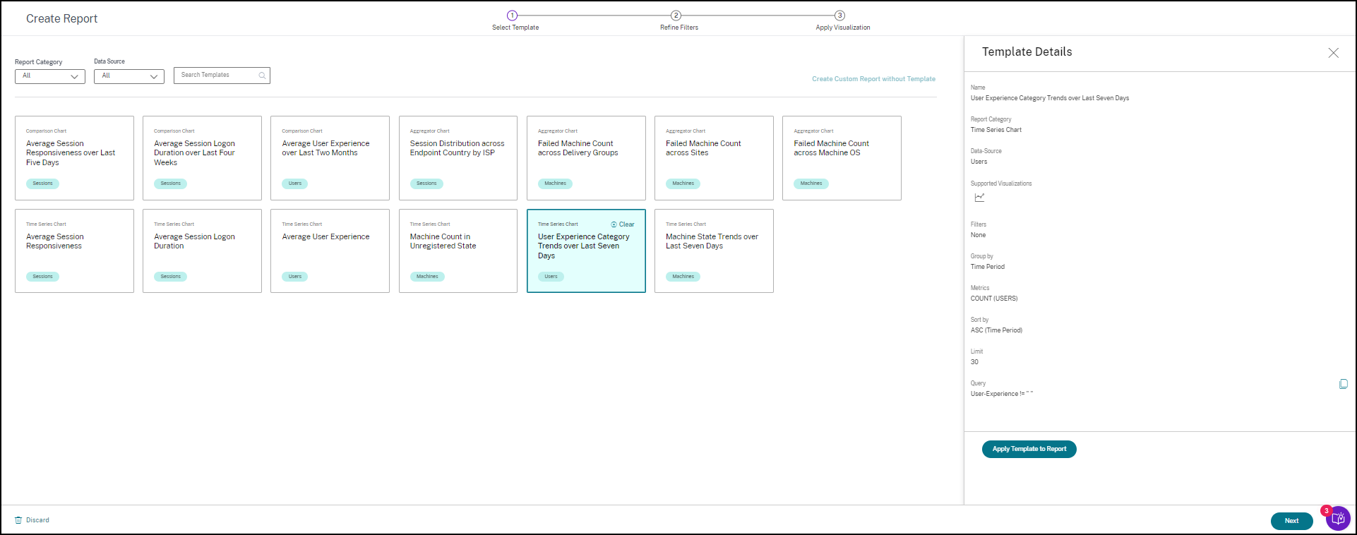
To create a custom report with template, do the following:
- Select a template. Choose the Report Category from among the following:
- Time Series Chart: This chart helps analyze a selected metric across a period, like the Average Session Responsiveness.
- Aggregator Chart: This chart plots aggregated values of a selected metric grouped by a characteristic (like region) over a period, such as the Session Distribution across Endpoint Country by ISP. It helps understand the session activity across different geographies and ISPs.
- Comparison Chart: This chart plots the average metric value compared over a set of time periods like Average Session Responsiveness over Last Five Days. It helps understand the performance of a given metric across different time periods.
- Choose a Data Source from among Users, Sessions, or Machines, and select one of the predefined templates for the chart.
- Templates based on the Users Data source:
- Average User Experience over Last Two Months
- Average User Experience
- User Experience Category Trends over Last Seven Days
- Templates based on the Sessions Data source:
- Average Session Responsiveness over Last Five Days
- Average Session Logon Duration over Last Four Weeks
- Session Distribution across Endpoint Country by ISP
- Average Session Responsiveness
- Average Session Logon Duration
- Templates based on the Machines Data source:
- Machine Count in Unregistered State
- Failed Machine Count across Delivery Groups
- Failed Machine Count across Sites
- Failed Machine Count across Machine OS
- Machine State Trends over Last Seven Days
- Templates based on the Users Data source:
-
Once you click a template, the template details are listed on the right. Click Apply Template to Report to enable the report to use the selected template.
-
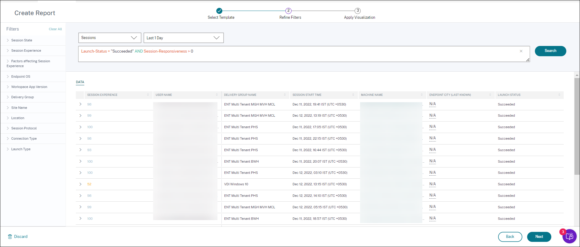
Refine Filters. On the Refine Filters page, the predefined filters as per the selected template are shown. Make the required changes and then click Next.
-
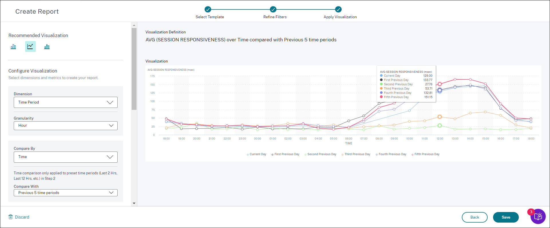
Apply Visualization. Choose the parameters that make up the chart.
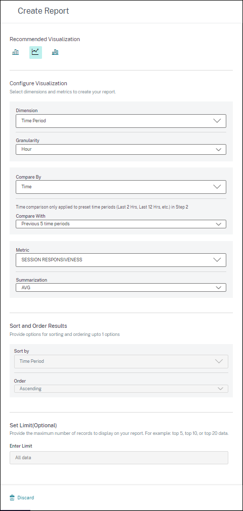
Select one of the available visualizations for displaying the report.
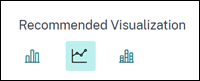
- Bar Chart: Presents data with vertical rectangular bars with height proportional to the values. Used for comparing events.
- Line chart: Presents data with dots connected by straight line segments. Used to visualize data trends over a time period.
- Stacked Column Chart: Presents data in the form of bars stacked one over the other. Used to visualize more than one data over the same time period.
- Now configure the visualization with the following parameters:
- Dimension for the x-axis,
- Plotting granularity,
- Metrics to be plotted in the y-axis,
- Summarization or aggregation, such as average or count, to be applied to the metric,
- Options for sorting and ordering
- An optional limit for the maximum number of records to be displayed on the report.
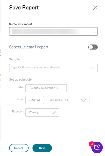
- To save the report, click Save. Specify a title for your report.
-
You can schedule to email the report to the specified email ids and distribution lists on a specific date and time. Further, you can choose to repeat this daily, weekly, or monthly.
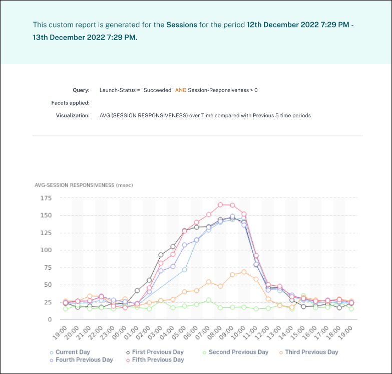
- After you have created and saved a report, you can view the report on the Reports page. You can also modify or delete a saved report.
-
Click the export icon to download the report in CSV format, PDF format or both formats.
You can also create a custom report without a predefined template. Click the Create Custom Report without Template link. Follow the steps to define the filters, apply visualization, save, and schedule the report.