-
-
-
Citrix Session Insights
-
-
-
This content has been machine translated dynamically.
Dieser Inhalt ist eine maschinelle Übersetzung, die dynamisch erstellt wurde. (Haftungsausschluss)
Cet article a été traduit automatiquement de manière dynamique. (Clause de non responsabilité)
Este artículo lo ha traducido una máquina de forma dinámica. (Aviso legal)
此内容已经过机器动态翻译。 放弃
このコンテンツは動的に機械翻訳されています。免責事項
이 콘텐츠는 동적으로 기계 번역되었습니다. 책임 부인
Este texto foi traduzido automaticamente. (Aviso legal)
Questo contenuto è stato tradotto dinamicamente con traduzione automatica.(Esclusione di responsabilità))
This article has been machine translated.
Dieser Artikel wurde maschinell übersetzt. (Haftungsausschluss)
Ce article a été traduit automatiquement. (Clause de non responsabilité)
Este artículo ha sido traducido automáticamente. (Aviso legal)
この記事は機械翻訳されています.免責事項
이 기사는 기계 번역되었습니다.책임 부인
Este artigo foi traduzido automaticamente.(Aviso legal)
这篇文章已经过机器翻译.放弃
Questo articolo è stato tradotto automaticamente.(Esclusione di responsabilità))
Translation failed!
Citrix Session Insights
The Citrix Session Insights dashboard is one of uberAgent UXM’s Splunk starting dashboards. It provides an overview of typical performance patterns across your Citrix environment. The dashboard helps you compare current behavior with historical trends. It calculates baseline values for the categories of session logon duration, poor responsiveness, and session disconnects.
Baseline Configuration Settings
Baseline values are calculated based on events that occur within a specific daily time interval, known as the baseline sample window. Additionally, the dashboard considers a baseline time range. This means that the baseline sample window is repeated across multiple days.
Both the baseline sample window and the baseline time range are configurable. Click the Baseline Configuration Settings menu to open the settings panel.
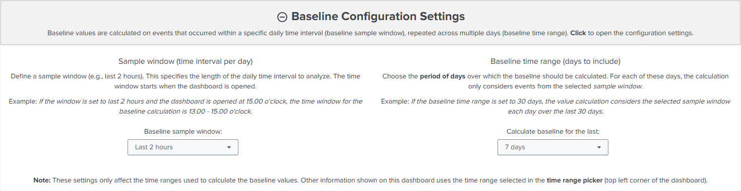
On the left-hand side, the dashboard lets you select the sample window. This setting specifies the length of the daily interval you want to use for your baseline calculation. The time window begins when you open the dashboard. For example, if you set the sample window to “last 2 hours” and open the dashboard at 15:00 o’clock, the effective baseline sample window would be from 13:00 to 15:00 o’clock.
On the right-hand side of the dashboard, there is an option to choose the baseline time range. This setting determines how many days to include in the calculation of the baseline. For each day, the calculation considers only events from the selected sample window. The default value for this setting is 7 days. Before selecting a baseline time range of 30 days, it is advisable to allow a minimum of 30 days to pass following the update of the Splunk apps to ensure optimal search performance.
Let’s revisit the previous example. Assuming the baseline time range is set to seven days, the baseline is calculated for events that occurred between 13:00 and 15:00 o’clock each day over the past seven days.
Please note that the settings in this panel only affects the baseline sample window and baseline time range. When comparing events with baseline values, the dashboard considers the selected time span in Splunk’s time range picker (top left corner of the Splunk interface).
Baseline Calculation
The baseline calculation considers events that occurred within the sample window during the baseline time range. Ultimately, the Splunk dashboard calculates the 80th percentile of all events in each category.
Working With The Dashboard
Session Logon Duration

Below the category’s headline, the dashboard shows a brief overview of how many sessions contributed to the baseline value calculation and how many of those sessions had a longer total logon duration than the overall baseline.
After clicking on the headline, the dashboard displays a time chart offering the option to correlate the baseline logon duration with the logon duration trend per day. For the latter, a mathematical function can be selected.
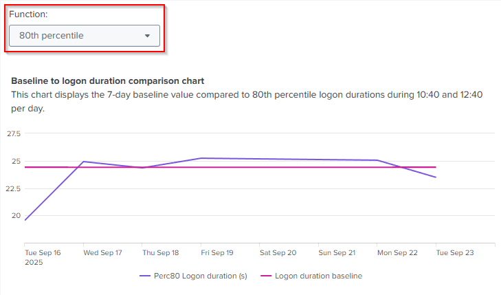
By default, the chart correlates the 80th percentile of logons per day with the overall baseline value.
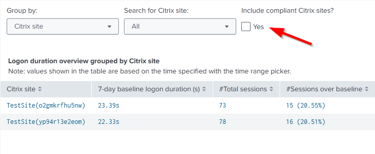
On the right-hand side, the dashboard displays the Logon duration overview grouped by table.
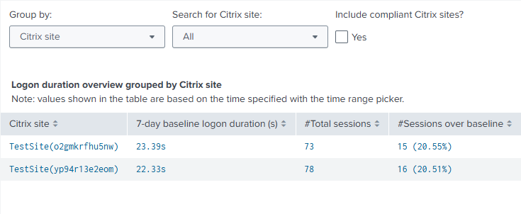
The values shown in this table are based on the time range selected using the Splunk time range picker. Events are grouped by categories such as Citrix site, Citrix delivery group, or hardware model. You can select a different component in the dropdown menu to configure the grouping; Citrix site is the default grouping.
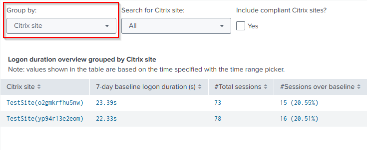
Additionally, the dashboard now displays grouping-specific baseline values. These values can differ from the overall baseline value, because the overall baseline is not based on any grouping. By default, the table only shows groupings that exceed their baseline values. This means that the table only shows groupings where at least one session had a logon duration higher than its baseline value.
To display groupings where all logons where compliant (i.e., lower or equal to the baseline), enable the filter Include compliant groupings?.
After selecting a grouping, an in-page drilldown opens showing logons that are:
- Not compliant, meaning the total duration exceeds the baseline for the specific grouping.
- Partially compliant, meaning that the total duration is lower than the baseline for the grouping, but the baseline values for the individual logon phases are higher than the baseline values for those phases.
- Compliant, meaning the total duration is lower or equal than the grouping-specific baseline, and the individual logon phases are also lower or equal than their respective baseline values.
Clicking on one of these numbers displays a table listing the individual logon in the specific category.
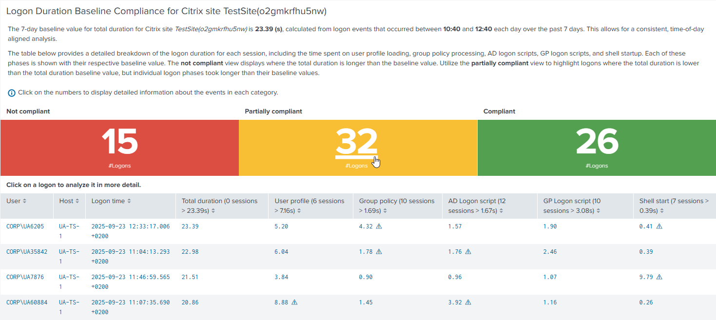
Select a logon to analyze it in more detail on the Single Logon dashboard.
Poor Responsiveness
Below the category’s headline, the dashboard displays an overview of the number of sessions that contributed to the baseline value calculation and the number of sessions with worse responsiveness than the overall baseline for ICA latency and round-trip time.

Note: ICA latency and round-trip time events are aggregated as medians before being counted toward the baseline calculation. Therefore, the baseline is based on median values per session.
After clicking on the headline, the dashboard displays a time chart offering the option to correlate ICA latency and round-trip time baseline values with the daily trend of all ICA latency and round-trip time values. For the latter, a mathematical function can be selected.
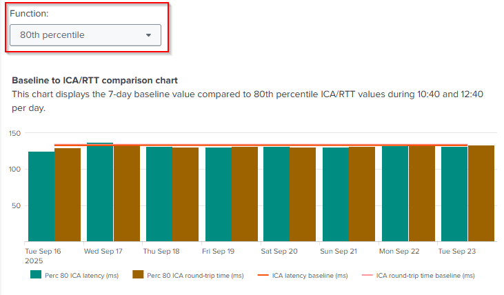
By default, the chart correlates the 80th percentile of the median of ICA latency and round-trip time events per day with the overall baseline value.
On the right-hand side, the dashboard displays Responsiveness overview grouped by table.
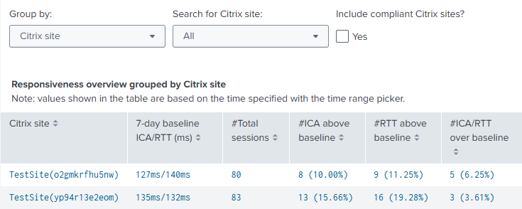
The values shown in this table are based on the time range selected using the Splunk time range picker. Events are grouped by categories such as Citrix site, Citrix delivery group, or hardware model. You can select a different component in the dropdown menu to configure the grouping; Citrix site is the default grouping.
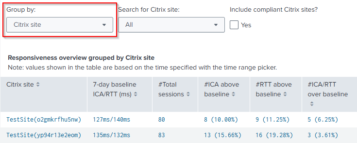
Additionally, the dashboard now displays grouping-specific baseline values. These values can differ from the overall baseline value, because the overall baseline is not based on any grouping. By default, the table only shows groupings that exceed their baseline values. This means that the table only shows groupings where at least one session had worse median ICA latency and round-trip time than its baseline value.
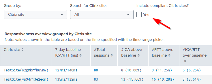
To display groupings where the responsiveness of all sessions was compliant (i.e., lower or equal to the baseline), enable the filter Include compliant groupings?.
After selecting a grouping, an in-page drilldown opens showing sessions that are:
- Not compliant, meaning the median session ICA latency and round-trip time are higher than the baseline for the specific grouping.
- Partially compliant, meaning the median session ICA latency or round-trip time is higher than the baseline for the specific grouping.
- Compliant, meaning the median session ICA latency and round-trip time is lower or equal than the grouping-specific baseline.
Clicking on one of these numbers displays a table listing the individual sessions in the specific category.
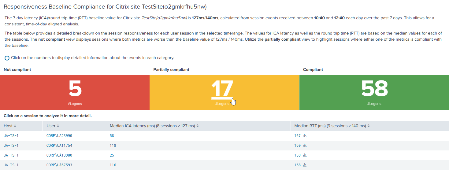
Select a session to analyze it in more detail with the Analyze data over time: User Sessions dashboard.
Session Disconnects
Below the category’s headline, the dashboard shows a brief overview of how many sessions contributed to the baseline value calculation and how many of those sessions had more disconnects than the overall baseline.

After clicking on the headline, the dashboard displays a time chart offering the option to correlate the baseline value of session disconnects with the daily trend of all session disconnect values. For the latter, a mathematical function can be selected.
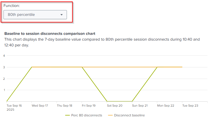
By default, the chart correlates the 80th percentile of session disconnects per day with the overall baseline value.
On the right-hand side, the dashboard displays Session disconnects overview grouped by table.
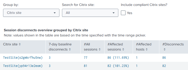
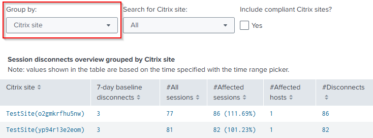
The values shown in this table are based on the time range selected using the Splunk time range picker. Events are grouped by categories such as Citrix site, Citrix delivery group, or hardware model. You can select a different component in the dropdown menu to configure the grouping. Citrix site is the default grouping.
Additionally, the dashboard now displays grouping-specific baseline values. These values can differ from the overall baseline value, because the overall baseline is not based on any grouping. By default, the table only shows groupings that exceed their baseline values. This means that the table only shows groupings where at least one session has had more session disconnect events than its baseline value.
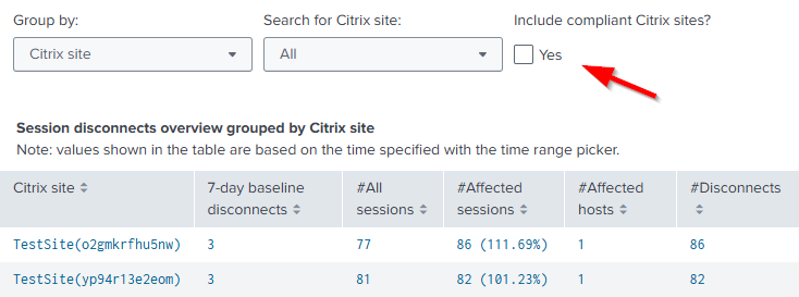
To display groupings where all sessions’ disconnect events were lower than or equal to the baseline, enable the filter Include compliant groupings?.
After choosing a grouping, an in-page drilldown opens. The dashboard then displays a time chart listing all session disconnect events. Below the chart is a table that provides details for the values you see in the chart.
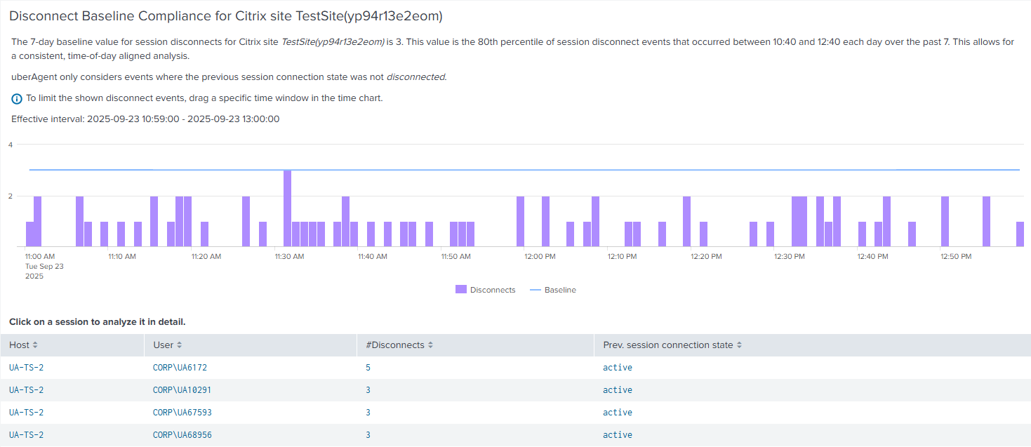
You can also limit the search results in the table by dragging a specific time window in the time chart. This function allows you to zoom in on a specific time to see more detailed data.
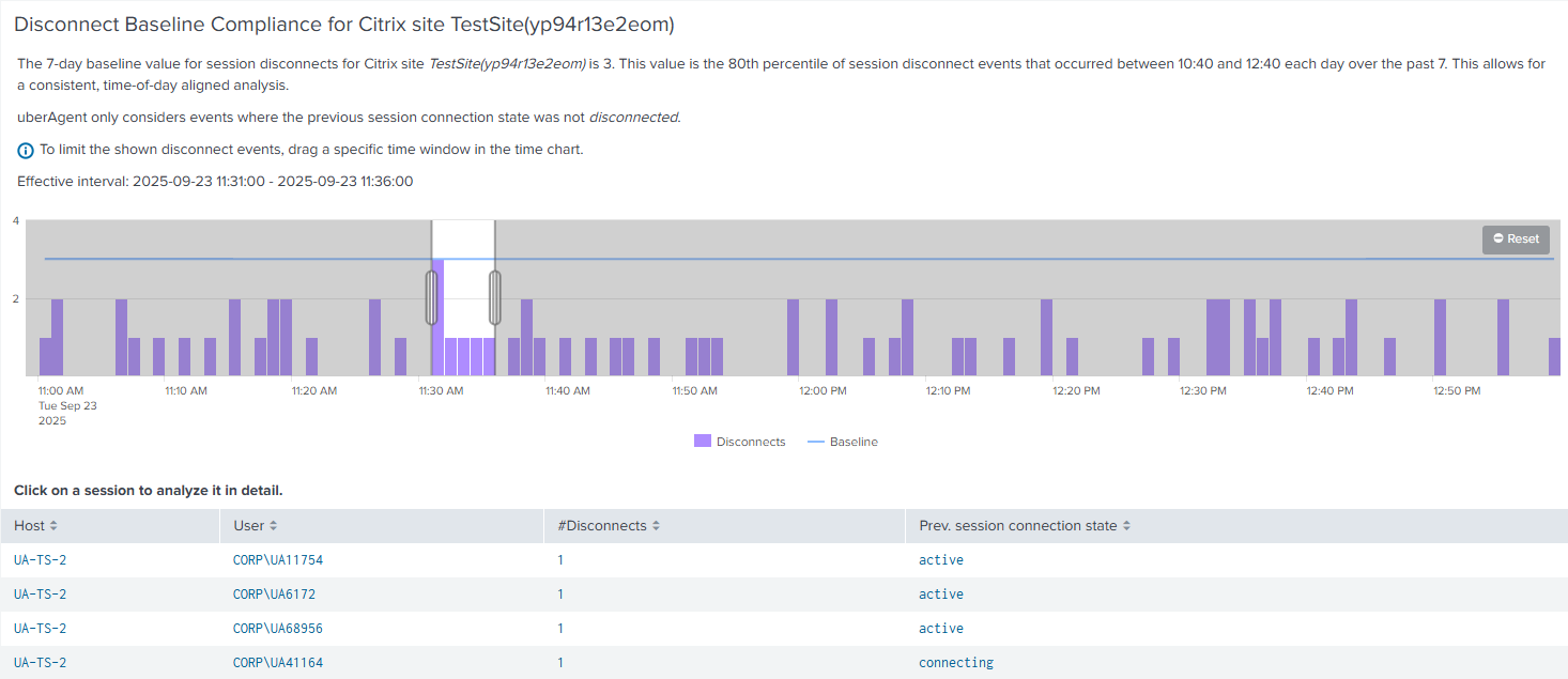
Select a session to analyze it in more detail with the Analyze data over time: User Sessions dashboard.
Share
Share
This Preview product documentation is Citrix Confidential.
You agree to hold this documentation confidential pursuant to the terms of your Citrix Beta/Tech Preview Agreement.
The development, release and timing of any features or functionality described in the Preview documentation remains at our sole discretion and are subject to change without notice or consultation.
The documentation is for informational purposes only and is not a commitment, promise or legal obligation to deliver any material, code or functionality and should not be relied upon in making Citrix product purchase decisions.
If you do not agree, select I DO NOT AGREE to exit.